BRANDING
When Paul Brucciani FCIIS set out to launch Cresco Consulting, his new cybersecurity marketing agency, he wanted a brand identity that would stand apart in an industry often dominated by heavy, tech-driven visuals (think padlocks and circuit boards). His vision was to lean towards the opposite end of the scale, focusing on organic branding that emphasised growth and authenticity rather than the traditional “brutal” cybersecurity motifs. Here’s how we brought that vision to life...
Degree Architecture is your partner in crafting timeless, functional, and visually striking spaces. We blend innovative design with precision to bring projects to life that reflect your brand and vision.

The name Cresco is rooted in the Latin word for “I grow,” which perfectly aligns with Paul’s focus on helping cybersecurity companies expand their reach. Additionally, given Paul’s Italian heritage (his surname, Brucciani), I wanted to subtly incorporate an Italian feel into the brand.

After sketching, I transitioned the ideas into Photoshop for more polished logo concepts. During our first ideation meeting, Paul immediately gravitated to the same concept I favoured (top right) - a great sign that we had found the right direction.

Modern branding requires multiple logo formats to maintain consistency across platforms. Alongside the main logo, I developed:
Inline Logo: For horizontal placements where space is limited.
Emblem Logo: Perfect for circular or tight spaces such as social media profile pictures and other small-format placements.

Paul had a strong preference for using purple and cream as primary brand colours, supported by shades of green and red. Each choice carried meaningful symbolism:
Purple: Historically signifies high value and luxury (going back to Roman times when purple dye was scarce and precious and only worn by Emperors).
Cream: A balanced counterpart to purple, offering a softer, more welcoming touch than stark white.
Green & Red Accents: Subtle nods to growth and urgency.


Before heading into digital design, I began with a simple “brain dump.” Sketching out ideas by hand allowed me to explore various styles and elements; from tree motifs representing growth, to organic shapes that underscored the brand’s nature-focused approach. These initial scribbles helped me focus my ideas before heading into Photoshop to create something presentable.

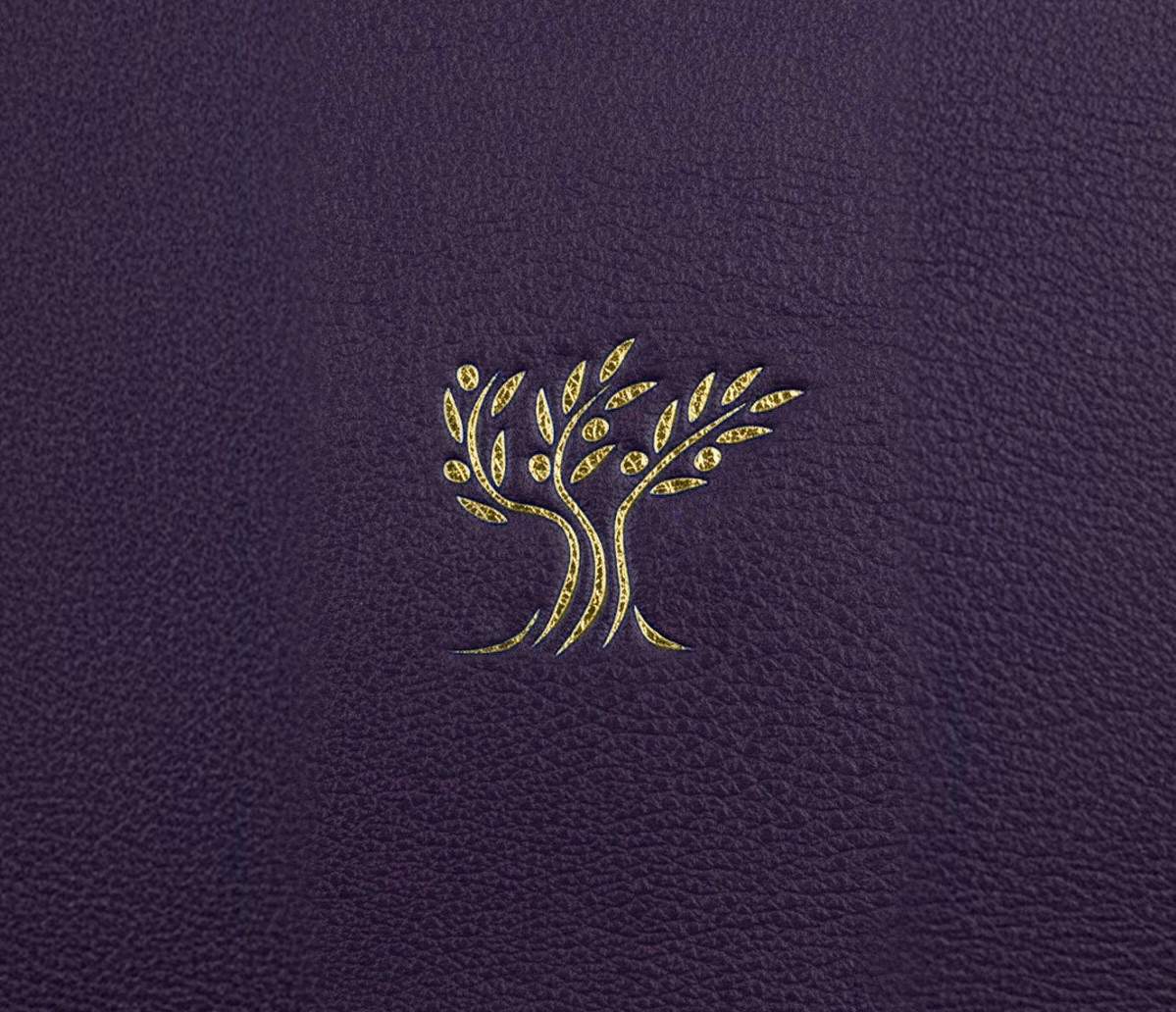
The tree motif resonates with Cresco’s core meaning of “to grow,” while organic shapes, free of harsh lines, lend warmth and accessibility to the brand. By choosing an olive tree specifically, we not only reference Paul’s Italian heritage but also draw upon the olive tree’s universal symbolism of peace and prosperity.

Paul had already chosen Raleway for body copy - a clean, versatile font that’s easy to read both online and in print. I wanted to introduce a distinguishing heading font to complement Raleway, which we agreed would be Miller Display. This timeless serif font adds a feeling of prestige, reflecting Paul’s 25+ years of expertise in the cybersecurity sector.

The new brand identity for Cresco has already garnered enthusiastic feedback. Clients and partners alike appreciate its unique blend of organic design, growth symbolism, and the refined touch of Paul’s Italian heritage. Most importantly, the branding gives Cresco a distinctive presence in the cybersecurity marketing space - precisely what Paul set out to achieve.
Take a look at the branding in action on Paul’s page: Cresco Cyber Consulting
The name Cresco is rooted in the Latin word for “I grow,” which perfectly aligns with Paul’s focus on helping cybersecurity companies expand their reach. Additionally, given Paul’s Italian heritage (his surname, Brucciani), I wanted to subtly incorporate an Italian feel into the brand.


Before heading into digital design, I began with a simple “brain dump.” Sketching out ideas by hand allowed me to explore various styles and elements; from tree motifs representing growth, to organic shapes that underscored the brand’s nature-focused approach. These initial scribbles helped me focus my ideas before heading into Photoshop to create something presentable.
After sketching, I transitioned the ideas into Photoshop for more polished logo concepts. During our first ideation meeting, Paul immediately gravitated to the same concept I favoured (top right) - a great sign that we had found the right direction.


The tree motif resonates with Cresco’s core meaning of “to grow,” while organic shapes, free of harsh lines, lend warmth and accessibility to the brand. By choosing an olive tree specifically, we not only reference Paul’s Italian heritage but also draw upon the olive tree’s universal symbolism of peace and prosperity.
Modern branding requires multiple logo formats to maintain consistency across platforms. Alongside the main logo, I developed:
Inline Logo: For horizontal placements where space is limited.
Emblem Logo: Perfect for circular or tight spaces such as social media profile pictures and other small-format placements.


Paul had already chosen Raleway for body copy - a clean, versatile font that’s easy to read both online and in print. I wanted to introduce a distinguishing heading font to complement Raleway, which we agreed would be Miller Display. This timeless serif font adds a feeling of prestige, reflecting Paul’s 25+ years of expertise in the cybersecurity sector.
Paul had a strong preference for using purple and cream as primary brand colours, supported by shades of green and red. Each choice carried meaningful symbolism:
Purple: Historically signifies high value and luxury (going back to Roman times when purple dye was scarce and precious and only worn by Emperors).
Cream: A balanced counterpart to purple, offering a softer, more welcoming touch than stark white.
Green & Red Accents: Subtle nods to growth and urgency.


The new brand identity for Cresco has already garnered enthusiastic feedback. Clients and partners alike appreciate its unique blend of organic design, growth symbolism, and the refined touch of Paul’s Italian heritage. Most importantly, the branding gives Cresco a distinctive presence in the cybersecurity marketing space - precisely what Paul set out to achieve.
Take a look at the branding in action on Paul’s page: Cresco Cyber Consulting